ANOVA Visualization


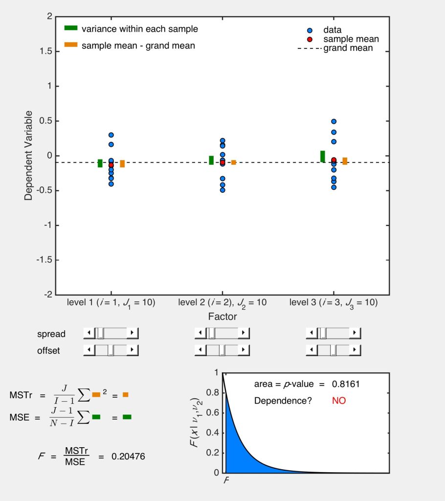
This MATLAB simulation helps visualize how one-way analysis of variance (ANOVA) works for three samples (I = 3) each with ten measurements (J1 = J2 = J3 = 10). The data in each sample are shown as blue circles. The sample mean (red circle), sample variances (green bars), grand mean (mean of the sample means, shown with a dashed black line), and the difference between each sample mean and the grand mean (orange bars) are shown illustratively in the plot. The slider bars are used to change the spread and offset of the ith sample.
The relative sizes of the treatment mean square (MSTr) and error mean square (MSE) are shown in the lower left of the window. The MSTr is proportional to the sum of the square of the length of the orange bars and the MSE is proportional to the sum of the length of the green bars. The F statistic is the ratio between the MSTr and MSE. The p-value is the area to the right of the F statistic under the F-distribution shown in the lower right of the window. In practice, one of the samples is “different” from the others if the p-value is less than 0.05 as indicated in the lower plot window (“Dependence?”).
This simulation requires MATLAB.
About:
This simulation was made at the University of Colorado Boulder, Department of Mechanical Engineering. Author: Keith Regner


